I make a living designing websites. But more often it feels like I spend most of my time undesigning them.
“No, you shouldn’t use a carousel.”
“No, you can’t have an imagemap.”
“How would that creative idea of yours work on mobile devices?”
At work, I am the deflator of ideas. I am dashing people’s dreams. I am the man from Del Monte saying no.
On the web, less is more. No-one visits a website to be wowed by the design. Very few of your users are coming to look for pretty pictures.
Your users want to complete a task. They want to find a piece of information. They are looking for a needle in a haystack.
Our job as web designers is to make it as easy as possible for our users to find that needle in the haystack. The last thing they need is for us to decorate that haystack like a Christmas tree.
Owen Williams at the Next Web says that web design in 2015 is too boring. Incredibly, the article bemoans the long overdue demise of Flash:
…the death of Flash might actually be a bad thing for creativity. Developers and designers loved Flash because it enabled audacious ideas…
Adobe Flash’s app was a single place to build those crazy ideas, even if it meant that creativity was at the expense of other things.
Ah, the C-word. Creativity. As if we were building a website to have fun.
Old-fashioned marketers and business owners loved Flash because it helped them temporarily dodge the difficult reality of the web. It lulled them into thinking that a website could be one great big never-ending TV ad. It let them think of the web as just another one-way broadcast medium.
Flash allowed them to ignore what the web is really all about: putting the user in control and giving them access to what they need as easily as possible.
The old-fashioned thinking still lives on to a frightening extent. And not just among those from a marketing background.
Web designers who came from a technical background just love solving problems that never really existed. They can’t resist stuffing their pages with needless JavaScript toys in the name of interactivity. (I can consider myself guilty on this count too.) Research tends to show that, more often than not, this needless functionality just gets in the user’s way.
Today, the web is in a very sorry shape. People believe that the web is inherently slow. That is because so many webpages have been bloated with horrific amounts of advertising, unnecessary JavaScript, pop-ups, pop-unders, pop-arounds and pop-it-up-your-bums.
Right now, with ad blockers hitting the mainstream, we are beginning to see the old orthodoxy crumble completely.
That is also why Facebook Instant Articles is taking hold. Once-mighty publishers now must go down on their knees to Facebook. That is because for the past 20 years they have utterly failed to do the one thing that could secure their future in the digital landscape: provide a good user experience.
The most successful websites are the ones that are less worried about being creative. Because the user could not care less how creative your website is. The best websites are the ones that give the user what they want when they want it.
I am a designer, but sometimes it feels like I am an anti-designer. I often find myself thinking: wouldn’t it be good if all websites had the same design, so that users wouldn’t have to re-learn how to use a wheel every time some smartarse decided to reinvent it?
Truly great design is invisible. Gov.uk is designed to within an inch of its life. No aspect of a Gov.uk webpage, no matter how trivial, would be published without a great deal of thought, and without it having been proved to be an improvement over what went before. The point is that the user wouldn’t know that.
In the same way, users don’t go to Google for its good design (although it is stunningly well designed, even if you think it is not aesthetically pleasing). People go to Google because it gets them what they want, now.
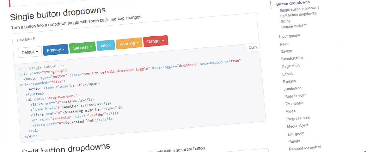
Yes, a lot of websites look the same today. Yes, a lot of them use Bootstrap.
I am not a particular fan of Bootstrap. While it provides a solid framework, for most cases it is too bloated. It also has some basic accessibility problems.
But despite those quibbles, I think the influence of Bootstrap on web design has been broadly positive. That is because it works, and it has been shown to work. Owen Williams’s article even says so:
It’s used so widely because it includes a great grid layout system and out of the box components, which make it easy for developers to quickly get new projects off the ground. The format works so well because it’s been A/B tested into oblivion — it converts people.
If it converts people, that means it’s working for both users and businesses. We are not painting the ceiling of the Sistine Chapel. So why should we care about whether it’s creative or not?
If web designers are settling on more standardised design conventions, that is a good thing.
The web is not a marketer’s broadcast platform, an artist’s paint set or a technologist’s plaything. It’s for helping us all find what we need. And more often than not, the most boring way is the best way.

This Article was mentioned on duncanstephen.co.uk