
The information architect Peter Morville likes to say: “all maps are traps”.
I think this sentiment is epitomised by Conway’s law, which notes the tight relationship between an organisational structure and an information architecture.
Both organisational structures and information architectures are often visualised in artefacts described as “maps”. I hypothesise that those maps are the traps that cause the problems resulting from Conway’s law.
The structure of an organisation is reflected in the things it makes
Conway’s law states:
Organisations that make systems are constrained to produce designs that copy the communication structures of these organisations.
In other words, the structure of an organisation is reflected in the things it makes.
Conway’s law can be a big problem for both users and organisations
Information architects are keenly aware of this. So much of my career has involved wrestling with websites structured the same way as the organisation that runs it. Sometimes it is even as brazen as each department having its own website.
This becomes a problem for users, because people should not to need to know the internal structure of an organisation just to get things done. On top of the user experience issues, for organisations it means duplicated effort, duplicated content, and common problems being solved multiple times in different ways. This is all costly and risky.
But Conway’s law doesn’t necessarily say it’s a bad thing. It just draws the connection. It’s natural that to make a system, the people making the system have to work together.
In theory, the solution to this would be to form multidisciplinary teams involving colleagues from across the organisation. But every organisation still complains about siloed ways of working.
Organisations are normally visualised as hierarchies
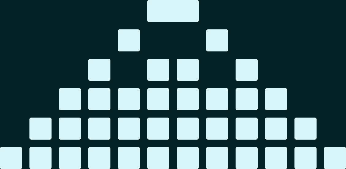
The problem is exemplified by the organisational chart. Typically, this visualises an organisation as a hierarchy. The biggest boss is shown at the top of the chart, with lines connecting them to their direct reports, and on and on until you reach the most junior people at the bottom.
The organisational chart is so embedded as an artefact that people usually expect to see it when they start a new job. People feel the need to know who reports to whom, and where the power lies.
But what if the way we visualise these structures is the problem?
The first ever organisational chart was multifaceted
The first ever organisational chart looked nothing like today’s rigid hierarchical pyramids. Produced in 1855, it depicted the working structures of a company building a 500-mile-long railway in the US.
Strikingly, the company president was not depicted at the top of the chart. Instead, they were the base of a tree, surrounded by roots representing the board of directors. Different departments emerged from this base as flowing, organic shoots. Teams were buds at the tips of the shoots.
Leaders were described as being at the “back”. Front-line workers were at the “sharp edge”, with the autonomy to make decisions.
Most significantly, this organisational chart conveyed so much more than reporting lines. It also showed what staff members did, where on the 500-mile-long line they worked, and what physical assets were available at each location. Meanwhile, the chart’s flowing, organic shapes are said to have suggested the organisation’s social and informal connections just as strongly as the formal reporting lines.
It was also intended to show how information should flow through the organisation, when reporting back from the front line. This was a response to the invention of the telegraph a few years earlier, which caused an explosion of information.
Today’s organisational charts could be just as rich
This isn’t to say that a template like this would automatically be more appropriate in other contexts. The point is that the first organisational chart was an innovative response to a real problem — how to co-ordinate the operations of a massively expanding infrastructure project in an era of information overload.
Today, organisational charts are created mostly because they are expected to be created. As such, they lazily depict an organisation as a rigid pyramid where only reporting lines matter. This is a fraction of the information expressed in that pioneering organisational chart.
A richer organisational chart could convey a wide array of other relevant information about an organisation and its workforce, depending on the problem it seeks to solve. It might show various ways people might be connected beyond just reporting lines:
- Locations
- Working patterns
- Projects
- Skillsets
- Resources
- Communities of practice
- Staff networks
…and all manner of things that matter to the day-to-day operations of an organisation.
Instead, staff members are routinely flattened by their organisational charts to say: “you are here, this person is your boss, and nothing else really matters”.
And then we wonder why people complain about siloed ways of working.
Visualisations are constrained
A visualisation is a two-dimensional artefact. This is a constraint. By necessity, a map grossly simplifies a real-world concept.
Often, simplification is the goal, and a laudable one at that. But when making a map, we must understand what problem we are trying to solve with it. What is it we need to simplify by conveying it visually?
When producing an artefact is the end in itself, just because it is deemed to be expected, we lazily resort to boilerplate formats and templates. These default options often fail to make the important things clearer.
Sitemaps grossly simplify information architecture
Information architecture’s crutch artefact is the sitemap. Sitemaps are frequently useful, and often even necessary to convey the ideas behind an information architecture. But they grossly simplify the realities of the decisions we make.
As with organisational charts, sitemaps essentially default to being top-down visualisations of a hierarchical structure.
In many sitemaps, each journey starts from the homepage. Each item of content is one page. Each page sits in one folder. Each folder has one parent. All roads lead from home.
(In reality, journeys usually start anywhere except the homepage.)
This all misleads our colleagues into thinking information architecture is just like arranging files into folders as if we were organising a filing cabinet in the 1960s. Or, at best, arranging Word documents in Windows 95.
But we are actually in the business of organising a modern digital system that affords an array of possibilities. Some may balk at the perceived complexity this entails. But we must serve the everyday user experience expectations that have existed since the advent of the web more than three decades ago.
Sitemaps that are easy for organisations can make things hard for users
A sitemap is easy for an organisation to conceive of. But what is simple for organisations often makes things difficult for our users.
When constrained by a pre-determined one-dimensional hierarchical sitemap, content managers are forced to choose one true home for content that may be multifaceted, for users coming with divergent needs, multiple perspectives and different lenses.
Sitemaps are also often confused by stakeholders for navigation systems. This is another dangerous simplification. Navigation is not the information architecture itself. Navigation is a separate system that is informed by an information architecture.
In reality, navigation must do more than display what folders webpages sit in. Even in the simplest hierarchical site structures, there is normally content that needs to be hidden from navigation. You also normally want to be able to automatically create navigation elements based on metadata, or to link from one section to another, or pull in content that is stored elsewhere.
A navigation system that is based only on a hierarchy displayed in a mega menu puts too much burden on users. It is like expecting motorway drivers to constantly look up the index page of a road atlas to find their way. We instead must provide them with road signs that tell them where they are, and where they can go from here.
Yes, it is more work to create a system of road signs than to produce one atlas. But in the words of the UK government’s design principles, our job is to do the hard work to make it simple for our users.
Simple sitemaps cannot do justice to the realities of our decision-making
It could be that the very simplicity of sitemaps explains Conway’s law. If you make simplistic organisational charts, you will probably make simplistic sitemaps. In this context, there is perhaps an inevitability that these two artefacts would simply reflect each other, in another act of simplification.
When Andy Fitzgerald drew a comparison between sitemaps and organisational charts, he illustrated an example of a “simple” sitemap he once created. It looks just like a traditional hierarchical chart. But he noted that to achieve this, the sitemap must represent at least four distinct systems that must interoperate predictably — classification, navigation, layout and content type.
He went on to point out that a venn diagram of these four interrelated systems has 15 distinct sections of overlap.
The visual sitemap cannot do justice to the realities of the decisions we need to make. Sitemaps instead lead us to focus on the wrong things.
Moving folders around a sitemap feels like important decision-making. But it is the digital equivalent of rearranging deckchairs on the Titanic.
But making sitemaps is often a useful exercise
Despite everything I have written here, sitemaps are frequently useful. Abby Covert’s guide to sitemaps for beginners outlines the most useful things they can do, and how to determine what your sitemap needs to convey.
The issue comes when the production of the sitemap itself is the problem we are asked to solve. For a sitemap to be useful, we must identify the actual problem we are trying to solve with our information architecture work.
In just the same way that having personas doesn’t necessarily mean you understand your users, having a sitemap doesn’t necessarily mean you understand your information architecture.
Personas have a bad rap these days. But personas are still useful if they are made in a thoughtful way that solves a real problem around understanding users or stakeholder engagement. The issue with personas comes when their creation is treated as a tick-box exercise in a user experience theatre production.
Making a sitemap is more important than the sitemap itself
Importantly, the process of making the artefact is more important than the artefact itself. As Martin Wright says, mapping is thinking:
The process of making the map is what helps us think, collaborate and move a problem forwards.
To recap:
- Making the map is more important than the map.
- Understanding why we need to make a map is more important making the map.
The original organisational chart adhered to these two points. That is what made it so useful to its creators.
A sitemap that adheres to these two points is also likely to be useful to its creators.
If we remembered these two points more often, maybe Conway’s law would no longer be a law.
All maps are traps. But as long as we know why we’re doing it, mapping is where it’s happening.