Screenshot of the text only version of the NPR website

The hurricane web

This post really underlines how media companies have taken the web in totally the wrong direction.

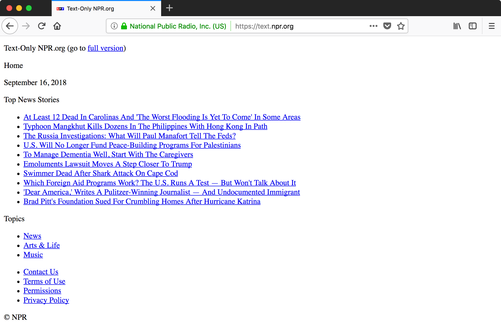
It shows how media organisations like CNN and NPR brought out lightweight “text only” versions of their websites to help hurricane-stricken areas with low bandwidth.

…in some aspects, they are actually better than the original.

Most importantly, it’s user friendly. People get what they came for (the news) and are able to accomplish their tasks.

It reminds me of the GDPR compliant version of the USA Today website, which many noted was actually a far better experience than the standard version that was filled with trackers and ads.

Think how brilliant the web could be again, if people removed all the crap from their pages and focused on what users actually need.

The BBC Domesday Project

A fascinating long article on the BBC Domesday Project from 1986. This huge project celebrated the 900th anniversary of the Domesday book, with an ambitious modern-day take on documenting all of Britain.

The technology was so unique that became obsolete almost immediately. It required a special LaserDisc player connected to a BBC Master computer with a special controller. The price tag put it out of reach of almost everyone, even schools and libraries.

It’s a prime example of the challenges of digital preservation.

Moreover, copyright issues — as well as the sheer volume of content — have raised questions over whether some the content could ever be used again. It is certainly difficult to replicate the original experience (although a few YouTube videos give a flavour).

This article goes into some of the thinking behind the technology decisions, and makes a valiant case that the Domesday Project is not a failure, as some like to think of it.

The FAQ as advice column

FAQ sections are derided by most content designers, myself included. But (as usual) it is not necessarily the format itself that’s the problem. Normally, the real problem is bad implementation.

This piece by Caroline Roberts makes a provocative case in favour of FAQs, by comparing them with advice columns.

The FAQ structure has held up for so long because it is a brilliant pattern. Think the Socratic method. Or the catechism. Or Usenet. Or “FAQs about FAQs.” Or — you guessed it — “Dear Prudence,” “Dear Sugar,” or any other popular advice column. Users will always have questions, and they will always want answers.

What makes FAQs troublesome is incorrect or lazy use. Lisa Wright has already shared what not to do, but perhaps the best way to start an FAQ is to choose each question with great care. For example, advice columnists spend plenty of time selecting what questions they will answer each week.

The Apple Podcasts Chart is screwed. How should we replace it?

This article by James Cridland lays bare just how widespread the gaming of Apple’s podcasts chart is.

I have heard presenters pleading with their listeners to unsubscribe, then resubscribe to help improve their position in the chart. Apparently it works.

What I don’t understand is why Apple let this happen? I’m sure it’s not an easy problem to fix. But it surely can’t be as hard as penalising dodgy SEO tactics or email spam filters. What’s in it for Apple?

These classic BBC Two idents designed by Lambie-Nairn have now been retired — but not for the first time.

They were first replaced in 2001 by the Personality idents, which (despite the name) were actually rather insipid by comparison. Then came the downright dull Window on the World idents.

Lambie-Nairn’s idents returned in 2014. But they were originally developed in 1991. At the time, they were credited with transforming wider perceptions of the channel. It had been seen as dull and worthy, but became arty and exciting.

27 years is a hell of a long time for these idents to last, especially considering the subsequent shift to widescreen, then HD broadcasting. They have pretty much stood the test of time.

Later idents in the set became more complex and less focused. But I am especially fond of the very original idents from 1991, which were particularly pure and striking. The use of the Gill Sans 2, coloured with viridian, and backed with ethereal music, is such a simple idea, yet it was employed with remarkable versatility.

Are we designers shamelessly good at self promotion?

An analysis of content about design — why people write it, how they look for it, and why it needs to be better.

Last year, we published and shared 4,302 articles and links with the community …

That’s a lot of links.

Most of them 5-minute Medium articles.

Not as thorough as we would like them to be.

Not deep at all.

Not as honest as our industry deserves.

This makes me wonder if my own approach — blogging daily with a link to and short remark about a 5 minute read — is wrong.

We definitely need to find more ways to write and think more deeply about design, and spend less time with superficial, self-promotional clickbait.

More on this from Khoi Vinh: Why designers don’t want to think when they read.

See also: Platforms, agile, trust, teams and werewolves — on why we need to see more stories about failure.

How a Google Maps update lead to the promotion of fringe views

Google Maps made a small tweak to its interface so that the fully zoomed-out view displayed as a globe, rather than the Mercator projection it use before.

Peter Gasston noticed that the angle many news publications found was to cover the reaction from flat Earthers.

This gave ad-funded publishers their opportunity to get some attention money: a simple product update isn’t a story, but a manufactured controversy is…

The result is that a manufactured controversy about a minor product update has given false equivalency to the fringe views of a small band of crackpots so everyone can get a few pennies in advertising revenue. This is the attention economy in action, and it’s rotten.

Remember that repeating a lie — even while you make clear that it’s a lie — makes people more likely to believe it’s true.

This is how the media works these days. And it explains a lot about what’s going on in the world right now.

Scotsman screenshot

It’s no wonder newspaper websites are in trouble. Their latest scheme is to “lock” content by turning it into squiggles unless you watch at least 6 seconds of an advert. Needless to say, this is a horrible experience, and only makes it all the more likely that I’ll turn away from certain websites.

I’m afraid to say that I know I’m going to have a dreadful time any time I try to read anything on the Scotsman or any other Johnston Press website. Every time, I am bombarded with a cacophony of offensive adverts, which grind my computer to a halt. And when they deign to show me the content I came for, more often than not it’s badly written, and clearly a rush-job by a stressed-out writer being made to churn out any old crap in the name of volume.

Why would I bother following a link to the Scotsman website again?

From catfishing to unregistered religious marriages: finding news stories hidden In Plain Sight

This looks like a great initiative being driven by some journalists in the BBC.

It was in a conversation following the Grenfell Tower disaster, instigated by our former Director of News, James Harding, which brought about the In Plain Sight project.

In Plain Sight set out to get to those stories and tell them in a way that resonates with younger and more diverse audiences.

To do that, we’re not creating a new programme, platform or launching another BBC brand. We’re simply making sure sure that younger, more diverse members of staff are given a platform to pitch stories and then are producing and reporting those stories themselves across existing BBC outlets.

We have been running manager-free sessions, where we invite along staff from across the BBC to come and pitch ideas.

Annoying online ads cost business

Results from a study of users of Pandora has quantified the effect of shoving adverts in users’ faces. As part of the experiment, a section of users were served fewer ads than normal, and another section were served more ads than normal.

…after 1.5 years of being exposed to the experimental conditions, people did use the service more, the fewer ads they were served. At the end of the experiment:

  • The low-ad group listened for 1.7% more hours weekly than the control group.
  • The high-ad group listened for 2.8% fewer hours weekly than the control group.