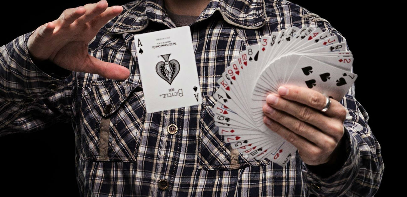
Curiosity can save us when lies come dressed as numbers

How asking yourself some simple questions can help you detect bullshit statistics.

…A second virtue is that of curiosity, which we might think of as a hunger to know more, coupled with a tolerance for being surprised. Simple questions such as: “I wonder how they know that?”; “Is that better or worse than I might have expected?”; “What exactly do they mean?” often unlock far more insight than narrow technical queries.

Younger Americans better at telling factual news statements from opinions

About a third of 18- to 49-year-olds (32%) correctly identified all five of the factual statements as factual, compared with two-in-ten among those ages 50 and older. A similar pattern emerges for the opinion statements. Among 18- to 49-year-olds, 44% correctly identified all five opinion statements as opinions, compared with 26% among those ages 50 and older.

I find this a bit weird, because knowing a fact from an opinion is quite a basic and fundamental concept that was drilled into us at school. Perhaps older generations were not taught this. That would certainly explain a few things.

Does the universal symbol for disability need to be rethought?

Details of a project to create symbols representing people with invisible disablities.

Today, disability is represented by the International Symbol of Access (ISA), which was created by Danish design student Susanne Koefoed back in 1968. It’s a strong graphic of a person in a wheelchair that has had tremendous success in conditioning societies all over the world to respect and give preferential treatment and access to disabled people.

[Liam] Riddler agrees that the current symbol is extremely powerful and successful. But he points out that it really only works well for people with more visible disabilities, like those using wheelchairs or other visual aids. “In some instances, someone with an invisible disability might be mistaken for an able-bodied person, and as a result be subjected to abuse and unfair judgment as to why they’re using disabled-access facilities,” he explains via email. This, he says, can lead to unwarranted embarrassment, shame, and withdrawal from society.

It’s a noble idea, but surely creating multiple distinct symbols would only create further ambiguity. I’m not even sure people seeing the ISA necessarily see it as a person in a wheelchair, just as a save icon doesn’t mean you’re using a floppy disk.

More: Visability93 — McCann London.

Glasgow’s urban decay risks squandering 30 years of progress

More on the decline of Glasgow — and the lack of any action plan to reverse it.

Go west along the river and you’ll see a hotchpotch of development, wasteland and missed opportunity that literally only takes you so far – Glasgow must be one of the few cities in Europe where it’s not possible to walk or cycle right along the banks.

The urban realm of Glasgow is deteriorating through fire, desertion and neglect in a quite ghastly way, and what is most alarming is the seeming lack of a strategic plan to reverse it.

See also: What next for Sauchiehall Street?

Big tech warns of ‘Japan’s millennium bug’ ahead of Akihito’s abdication

To be filed under ‘you learn something new every day’ — a series of potential millennium bug-style issues that could be faced when Emperor Akihito of Japan abdicates. Japanese calendars effectively begin from zero with a new era every time there is a new emperor.

Akihito has been on the throne for almost the entirety of the information age, meaning that many systems have never had to deal with a switchover in era.

Moreover, Unicode will have to create a new character to represent the new era — which has not yet been named. This clashes awkwardly with the planned release of Unicode 12.0.

But this is the most incredible scenario:

Many older computers, with aspects dating back to before the end of the Shōwa era in 1989, have never been updated to reflect the new era, and still think the year is Shōwa 93. That means Japan could face another mini Y2K problem in 2025, as those systems attempt to tick over to a three digit Shōwa year they can’t cope with.

Everything bad about Facebook is bad for the same reason

How Facebook’s focus on the connections between users, rather than the humans who use it, is its core problem.

Underlying all of Facebook’s screw-ups is a bumbling obliviousness to real humans. The company’s singular focus on “connecting people” has allowed it to conquer the world, making possible the creation of a vast network of human relationships, a source of insights and eyeballs that makes advertisers and investors drool.

But the imperative to “connect people” lacks the one ingredient essential for being a good citizen: Treating individual human beings as sacrosanct. To Facebook, the world is not made up of individuals, but of connections between them. The billions of Facebook accounts belong not to “people” but to “users,” collections of data points connected to other collections of data points on a vast Social Network, to be targeted and monetized by computer programs.

How a Google Maps update lead to the promotion of fringe views

Google Maps made a small tweak to its interface so that the fully zoomed-out view displayed as a globe, rather than the Mercator projection it use before.

Peter Gasston noticed that the angle many news publications found was to cover the reaction from flat Earthers.

This gave ad-funded publishers their opportunity to get some attention money: a simple product update isn’t a story, but a manufactured controversy is…

The result is that a manufactured controversy about a minor product update has given false equivalency to the fringe views of a small band of crackpots so everyone can get a few pennies in advertising revenue. This is the attention economy in action, and it’s rotten.

Remember that repeating a lie — even while you make clear that it’s a lie — makes people more likely to believe it’s true.

This is how the media works these days. And it explains a lot about what’s going on in the world right now.

From catfishing to unregistered religious marriages: finding news stories hidden In Plain Sight

This looks like a great initiative being driven by some journalists in the BBC.

It was in a conversation following the Grenfell Tower disaster, instigated by our former Director of News, James Harding, which brought about the In Plain Sight project.

In Plain Sight set out to get to those stories and tell them in a way that resonates with younger and more diverse audiences.

To do that, we’re not creating a new programme, platform or launching another BBC brand. We’re simply making sure sure that younger, more diverse members of staff are given a platform to pitch stories and then are producing and reporting those stories themselves across existing BBC outlets.

We have been running manager-free sessions, where we invite along staff from across the BBC to come and pitch ideas.

Broadband speed map reveals Britain’s new digital divide

It turns out that it is not just rural areas that are suffering due to BT/Openreach’s inability install broadband infrastructure fit for the 2010s, never mind the future.

The UK’s status as a fibre laggard has been the subject of intense debate within the telecoms industry, with only 4 per cent of residential and small business premises connected to full-fibre networks capable of delivering ultrafast speeds, compared with 80 per cent of units in Portugal.

It transpires that some of the slowest postcodes are within our largest cities, including London and Edinburgh.

With rural areas and second cities saying they have been left behind in the race to install ultrafast broadband networks, it is surprising to see that areas of London, including Kensington, Millwall on the Isle of Dogs and Rotherhithe, have clusters of postcodes with average speeds below the minimum required by the government. Central Manchester is a broadband blackspot, as is the Baltic Triangle in the heart of Liverpool, according to the postcode-level data.