
This post really underlines how media companies have taken the web in totally the wrong direction.
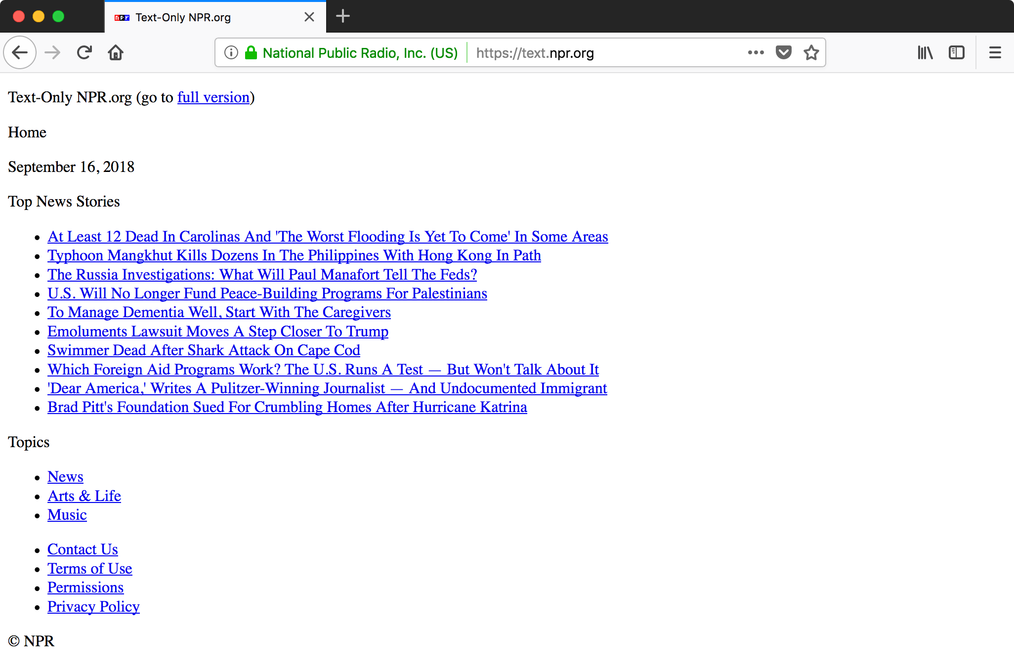
It shows how media organisations like CNN and NPR brought out lightweight “text only” versions of their websites to help hurricane-stricken areas with low bandwidth.
…in some aspects, they are actually better than the original.
Most importantly, it’s user friendly. People get what they came for (the news) and are able to accomplish their tasks.
It reminds me of the GDPR compliant version of the USA Today website, which many noted was actually a far better experience than the standard version that was filled with trackers and ads.
Because of #GDPR, USA Today decided to run a separate version of their website for EU users, which has all the tracking scripts and ads removed. The site seemed very fast, so I did a performance audit. How fast the internet could be without all the junk! 🙄
5.2MB → 500KB pic.twitter.com/xwSqqsQR3s— Marcel Freinbichler (@fr3ino) May 26, 2018
Think how brilliant the web could be again, if people removed all the crap from their pages and focused on what users actually need.