Card sorting has informed a new information architecture for Learn coursesWebsite and Communications Blog

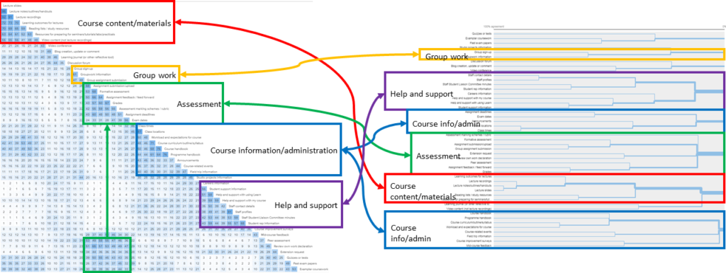
Results of the card sorting study

How we used card sorting to help us devise a consistent information architecture for Learn VLE courses at the University of Edinburgh.

775 students participated in the study — and no two students submitted the same card sort. This highlights the great challenge faced by the Learn Foundations project in attempting to create a more standardised template that meets the wide variety of needs across the University.

Creating the perfect UX workshop bag@kyecassUX Collective

✔️ Love stationery
✔️ Love workshops

This is a great guide to workshop essentials. I’m impressed that this kit contains a wider variety of materials, and yet seems so much smaller than the workshop bag we use at work. Maybe we rely too much on mountains of sticky notes!

I’d be tempted to add [planning poker](https://www.mountaingoatsoftware.com/agile/planning-poker) cards to this list. Planning poker is usually thought of as a technique for estimating work in agile projects. But it can also be used as a prioritisation technique in workshops.

What is co-design?Kelly Ann McKercherBeyond Sticky Notes

Venn diagram describing co-production as an overlap of co-planning, co-design, co-evaluation and co-delivery

I’ve been thinking and reading a lot about co-design recently (as well as doing some of it too). This website, Beyond Sticky Notes, has provided me with even more food for thought.

I am particularly struck by the table describing various approaches from transactional to transformational. In this model, “Anything ‘centred’ — human, user, patient etc.” is little better than “Designer as expert”. Meanwhile, what I thought of as co-design may actually be more like participatory design. There’s so much more to do.

But one line of warning is familiar to any good user experience practitioner, and is worth repeating until the cows come home.

Co-design builds long term commitment. By contrast, consultation often gives the illusion we’ve bought people on board — only to have them then fall overboard. With consultation, we pay later — often in costly, public and damaging ways.”

Make sure you also see Mindsets for co-design, another enlightening article on how to do co-design better.

This website is in support of a book due to be published in 2020. I am now looking forward to it.

Thanks to Alison Wright who retweeted the latter article and brought it to my attention.

Top tasks surveys have identified what really matters to students using LearnWebsite and Communications Blog

Pie chart of students' top tasks in Learn

As part of our programme of user research in support of the Learn Foundations project, we have carried out a top tasks survey to understand what students need when accessing course materials online.

What we found was that students value three items much more than everything else. Those items are *all* to do with lectures.

See the full post to find out more.

The elements of a better user experience in LearnWebsite and Communications Blog

The sketch that started it all

As part of the Learn Foundations project, we have carried out a programme of quantitative research to ensure a user-centred approach to solution development.

The Learn Foundations project team wanted to develop a new template using a user-centred approach. This template would be designed to introduce more consistency between different courses in Learn. But it also had to support a diverse variety of needs across different courses, supporting different schools, colleges and teaching needs. It also had to be developed quickly.

We took inspiration from a classic user experience diagram to ensure this new template could be built on firm foundations.

This post introduces the steps we took. Forthcoming posts will describe each step in more detail and some of our key findings.

Interviews with students to understand users’ needs and contexts around LearnWebsite and Communications Blog

Foam board summarising insights from interviews with students

Summarising the key findings from a set of user interviews I conducted with students on their needs around accessing course materials digitally. Just one of the strands of the Learn Foundations project, which I still have much more to write about.

After analysing and synthesising the insights gathered through the interviews, we built up a picture of how and why students’ experience with Learn varies throughout the year as students attempt to complete different tasks. This is presented as a semester in the life of students using Learn.

Encouraging self-service through improving content at the University of EdinburghLauren TormeyGatherContent

Diagram demonstrating process of continuous improvement

My awesome colleague Lauren Tormey wrote this blog post about a brilliant project she’s been involved in. She has been collaborating with our Information Services Helpline to reduce unnecessary support calls by iteratively improving content with a regular cycle of usability testing.

> Over two summers, we had done work to improve content related to getting a student ID card. This was another case of turning long pages with giant paragraphs into concise step-by-step pages.
>
> From July to September 2017, the IS Helpline received 433 enquires related to student cards. For this same period in 2018, they received 224, so the figure nearly halved. I repeat: halved.

Scapegoating user experience designKhoi VinhSubtraction

Stylised photo of a Nest camera

An article published yesterday in The Washington Post demonstrates the danger of design’s failure to broaden popular understanding of our craft.

The article pinpoints Nest’s focus on reducing friction as the reason for their cameras’ weak security.

Khoi Vinh points out that…

…the concept of user experience writ large is not to blame here; what’s actually at fault is bad user experience practice.

The point being that good security is fundamental to good user experience. As any good designer would know, they are not in conflict. Quite the opposite, in fact.

It strikes me that Nest are using ‘reducing friction’ as a poor excuse for not implementing better security. I’m sure they’re not the only ones guilty of this.

On another point, this article got me thinking about journalism. Khoi Vinh refuses to blame the Washington Post’s perspective on “lazy journalism”, perhaps correctly.

But any time I read a mainstream/non-specialist journalist write about a topic I know a little about (motorsport, the web, whatever), I’m always astonished at how many basic errors are made. It’s a challenge if designers want the help of journalism when “explaining what it is that we do to the world at large.”