

One of the most powerful methods in information architecture and user experience is also one of the least well-known. The top tasks method, pioneered by Gerry McGovern, uses a single survey question that tells you exactly what matters most to your users. I find it so effective that I’m amazed more people haven’t used it.
The top tasks method seems strange at first
It is literally one weird trick to improve your users’ experience.
It’s weird because this one simple but powerful question breaks the conventional rules of any other survey.
With a top tasks survey, you simply list the most common tasks your service offers, and present it to survey participants in one long column. Respondents are asked to quickly select the five items most important to them, and not to spend too long thinking about it.
That is the only question. It is possible to include additional demographic questions if you want to segment the data. This can be interesting if you have audiences with divergent needs, but it is not necessary.
The other important note is that you should randomise the list for each respondent. People are more likely to select items nearer the top of the list. Randomising the list helps deal with this bias.
How the survey works
The survey is bizarre by design. You would never normally publish a survey like this. People often believe it won’t work. The first time I came across it, I didn’t believe it would work.
But the very nature of the question is what makes it work. It turns out that by overwhelming your survey respondents, you actually get them to select what really matters to them the most.
Every time, the survey results in a zipf-like distribution. It’s the same sort of curve you might see if you analyse search logs or page traffic.
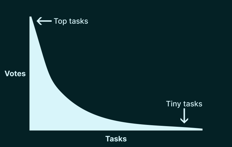
The exact shape of the curve can differ. But generally speaking, the top task is roughly twice as important as the second-top task, three times as important as the third-top task, and so on.
This is a graph with a “long neck” of important tasks, and a “long tail” of less-important tasks.
Sometimes, the least important tasks get zero votes from hundreds of responses.
How to use the results
The small handful of top tasks in the long neck are the ones you really need to focus your user experience efforts on. Because they are so important to your users, improvements in your top tasks will disproportionately improve the user experience of your service as a whole.
That’s not to say you shouldn’t pay any attention to “long tail” tasks. But this should be contextualised against the relative priority of your top tasks.
In short, we’re talking about the Pareto principle. 20% of your service is responsible for 80% of your results.
Before you create the survey though, you need to decide what tasks are going to go in it.
Shortlisting your top tasks
This normally involves getting together with your stakeholders to agree on up to around 100 tasks that you will present in a survey.
The shortlisting for the survey question often takes place over several workshops, each lasting an hour or two. Additional administrative tweaking goes on in between each workshop to do things like fix errors, weed out duplicates and flag up ambiguities for further discussion.
It can be possible to speed up this process if you have a lot of domain knowledge. For example, when I worked at a university as an in-house user experience consultant, I could often make a lot of big decisions during the administrative work in between workshops because I had lots of experience in the higher education sector.
However, it would be unwise to take this too far. That’s because the workshops themselves are nearly as important as the survey results.
The process is as important as the results
As is often the case, it’s not just about getting to the final output. It’s about the conversations you have while you get there.
It is common to discover that different people have very differing ideas of organisational priorities. Some people turn out to have very different understandings of key terms used throughout the business. Debates can rage.
This process itself can make the top tasks survey become eagerly anticipated as a means of getting answers to these questions.
The top tasks process shows an organisation that it has a major alignment problem that it didn’t even realise it had. Then, almost immediately, the survey results resolve it.
Results can seem obvious, but only in hindsight
The top tasks survey has an uncanny knack of producing results that seem screamingly obvious in retrospect. But usually results were not at all obvious before the survey took place.
One of the most successful top tasks studies I have been involved with was part of a programme of user research to improve the way a course materials within a virtual learning environment were structured.
Out of 46 tasks, over 25% of all the votes were for just three tasks. All of them were types of lecture material:
- Lecture slides
- Lecture notes/outlines/handouts
- Lecture recordings
In hindsight, it ought to be obvious that students mostly needed to access their lecture materials. But lecturers wanted to experiment with their pedagogy, and software developers enjoyed building new features. Their focus was often on quizzes, blogs and supplementary videos rather than lecture slides.
Meanwhile, I was finding through usability testing that students were often having a nightmare trying to find their lecture slides. One participant even confidently predicted that a hyperlink to their lecture slides would not work, before a “not found” error was duly returned.
Juxtaposed with the top tasks findings, this was a stark reminder to all: Getting the basics right is often the most important action you can take to improve user experience.
Interpreting the results
The shape of the curve can tell you what sort of information architecture you need to adopt.
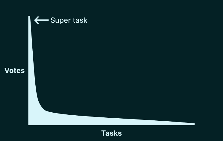
Some services have a very steep curve, with one task that towers above all the rest. Gerry McGovern calls this a super task.
Take an airline website. The top task is to book a flight. In this case, the task needs to be very easy to complete on the homepage. The rest of the tasks need to take a back seat, as much as you might want to upsell travel insurance, push credit cards, or get people to sign up to your newsletter.
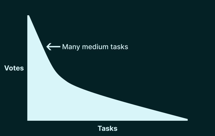
At the other end of the scale, you have some websites that need to offer a huge number of services that are broadly important to a lot of people.
A government website is a classic example of this. There are still some tasks that are more important than others. But the curve is much shallower. In short, the votes are distributed more evenly across tasks. This means the homepage needs to display a large number of categories with relatively equal priority.
Top tasks for a top-down information architecture
Top tasks works really well as a first step towards developing a top-down hierarchical site structure. You could also use this approach to develop a user-centred taxonomy within an information architecture.
Alongside the top tasks survey, it can be just as useful to perform a card sorting study. This is where participants organise tasks into groups that make sense to them.
For bonus research data, you can ask the participants to name those groups for you. This is called an open card sort. The alternative is a closed card sort where the category names have already been determined. Something in between those approaches is a hybrid card sort, where some category names are defined but participants are invited to create more of their own.
An open card sort makes it slightly harder for the participants to complete, and the data harder to analyse. But it’s often well worth doing, because gives you key insight into what terminology your users are most familiar with. Not sure what you should call a category? Then use an open card sort.
Those card sort findings can form the basis of an early site structure, which you can then take to tree testing. In a tree test you simply present people with a proposed navigation menu, and ask where they would go in the navigation to complete their task.
Following this process iteratively can provide a lot of confidence that your navigation system will work. This is all without even making a wireframe, never mind a high-fidelity Figma mockup. Forget needing to write any code.
This was the process I followed when I worked on the improved structure of a virtual learning environment. This research-driven approach helped bring sceptical schools on board with the plan to bring some standards into place.
It can sound like a strange process and a lot of steps. But in reality it’s a lightweight way of getting your concepts right before you commit to steaming ahead in the wrong direction in code.
Top tasks for a bottom-up information architecture
Gerry McGovern advises removing the verbs from the tasks you list in the survey. This is partly because, at least on a website, most of the tasks are to “find” something. Including the verb therefore becomes redundant, and only serves to make the list harder to scan.
Since usually only the nouns are left, this means that top tasks are really top objects if you’re following an object-oriented approach. You can use the results to determine the most important objects to be represented in your system.
From there, card sorting can be used to inform the development of your bottom-up content model.
It is useful to derive a content model from a semantic analysis developed with domain experts. But to ensure it is user-centred, we need to understand the mental models that our users have. In this case, card sorting tells us about users’ understanding of how different things in a service relate to each other. This may often be different to how experts or internal stakeholders understand things.
Combining top tasks with card sorting can help bring a content model into shape by ensuring it is user-centred. Content models should match users’ mental models to aid findability.