Trying to use the new F1 timing app

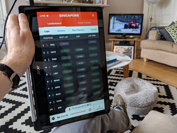
The new Formula 1 timing app is comically bad. Even on quite a large screen, it only shows 10 drivers — at a gigantic font size. Meanwhile, the live driver tracker is juddery and completely unusable.

But hey, I guess it uses Sean Bratches’ new fonts.

The old app wasn’t perfect, but at least it gave you all the information you needed to follow a session, and the driver tracker was usable.

It’s difficult to believe Liberty Media did any usability testing with any F1 fans before unleashing this style-over-substance atrocity.

Dundee’s renaissance — a personal, alternative view

Brian Taylor reflects on Dundee’s resurgence.

But mostly this renaissance is driven by the collective will of the people.

It is marvellous to behold.

Together, they have decided to stop apologising for their city. They have decided to revisit her ancient history and, hopefully, pursue her proud future.

See also: The city with grand designs

A fantastic piece on the history of Dundee’s creative renaissance, which has been decades in the making.

Congratulations and good luck to everyone involved in the V&A Dundee, which opens this weekend. I will be visiting later this month.

Inventive tips for separating your job from your life when you work from home

I don’t work from home, but I still enjoyed this piece on little rituals that help you separate work time from personal time.

I’m glad of my 30 minute buffer between home and work. [As I’ve said before, I wouldn’t reduce it](https://duncanstephen.net/why-i-wouldnt-reduce-the-length-of-my-commute/). The walk helps me ease my way into the day, and gives me the headspace to prepare for what’s to come, or — if it’s the end of my day — what’s just happened.

Does the universal symbol for disability need to be rethought?

Details of a project to create symbols representing people with invisible disablities.

Today, disability is represented by the International Symbol of Access (ISA), which was created by Danish design student Susanne Koefoed back in 1968. It’s a strong graphic of a person in a wheelchair that has had tremendous success in conditioning societies all over the world to respect and give preferential treatment and access to disabled people.

[Liam] Riddler agrees that the current symbol is extremely powerful and successful. But he points out that it really only works well for people with more visible disabilities, like those using wheelchairs or other visual aids. “In some instances, someone with an invisible disability might be mistaken for an able-bodied person, and as a result be subjected to abuse and unfair judgment as to why they’re using disabled-access facilities,” he explains via email. This, he says, can lead to unwarranted embarrassment, shame, and withdrawal from society.

It’s a noble idea, but surely creating multiple distinct symbols would only create further ambiguity. I’m not even sure people seeing the ISA necessarily see it as a person in a wheelchair, just as a save icon doesn’t mean you’re using a floppy disk.

More: Visability93 — McCann London.

5 thoughts on self-help

I have never read what I would think of as a self-help book. I’m sceptical of them. But at the same time I am interested in self-improvement. Or at least, keeping check on yourself and learning generally, which I guess is a form of self-help.

In this article, Austin Kleon points out that:

…the problem with self-help today is that it has returned to the very quick-fix pseudoscientific snake-oil cures that [the first self-help book, written by Samuel] Smiles (what a perfect name) was reacting to…

I would argue that this isn’t necessarily just a problem for the self-help genre either. I am inherently wary of anything that claims to provide a one-size-fits-all silver bullet solution. Because it’s bound to be more complicated than that.

One of the worst things that self-help can do is convince you that you as an individual are to blame for all of your problems, and that if you’re struggling it’s just because you aren’t making the right moves.

Worst of all, some self-help books imply that if the book fails to help you, it’s not the book’s fault, it’s yours.

Using contractions could be making your writing inaccessible

We found that some of these users did not understand sentences that had negative contractions in them (negative contractions are words like ‘can’t’, ‘won’t’, ‘don’t’). They interpreted the sentence without inferring the ‘not’.

I have been in two minds about using contractions for a while. On the one hand, avoiding contractions does seem to reduce ambiguity. But at the same time it can make your writing seem stilted and overly-formal.

As always with writing style, there will be no true answer, and the right way forward will depend on the circumstances. But if in doubt, it is worth considering avoiding contractions.

Designers are defining usability too narrowly

Another call on designers to think more widely when they are working on digital products. Khoi Vinh saw a Nielsen Norman Group report on best practice on websites aimed at children — but he felt the report focused too narrowly on usability.

I don’t dispute the findings at all. But it’s disturbing that the report focuses exclusively on usability recommendations, on the executional aspect of creating digital products for kids. There’s not a single line, much less a section, that cares to examine how design impacts the well-being of children…

We’re moving past the stage in the evolution of our craft when we can safely consider its practice to be neutral, to be without inherent virtue or without inherent vice. At some point, making it easier and easier to pull the handle on a slot machine reflects on the intentions of the designer of that experience.

Thinking in triplicate

This is a very strong piece by Erika Hall, raising some seriously good points and questions about where user experience design is, and where it needs to go. It is well worth reading the full piece, and me pulling out a quote cannot do this justice. But here are some selections I particularly liked:

If good design entailed good business, women’s clothes would come in a wide range of sizes with usable pockets and our social media feeds would unfurl in reverse chronological order with an unremarkable absence of Nazis.

While most of the designers I know are far from objectivists, design as it is currently practiced is tantamount to Ayn Rand’s radical selfishness. We design for the experience of a single user at a time and expect that the collective experience, and the collective impact, will take care of itself.

It’s much more pleasant for designers to talk about empathy in one room and MBAs to talk about profits in the other and have marketers in the middle like an injectable filler.

This is exactly the sort of article we need to be seeing more of.

The six main stories, as identified by a computer

We have all heard the idea that there are only a handful of different stories. Now we can feed stories into computers to see the six different story arcs that exist — the extrapolation of an idea first expressed by Kurt Vonnegut.

This may not seem like anything special, Vonnegut says—his actual words are, “it certainly looks like trash”—until he notices another well known story that shares this shape. “Those steps at the beginning look like the creation myth of virtually every society on earth. And then I saw that the stroke of midnight looked exactly like the unique creation myth in the Old Testament.” Cinderella’s curfew was, if you look at it on Vonnegut’s chart, a mirror-image downfall to Adam and Eve’s ejection from the Garden of Eden. “And then I saw the rise to bliss at the end was identical with the expectation of redemption as expressed in primitive Christianity. The tales were identical.”

Designing Google Maps for motorbikes

Some nice work from Google Maps on how they immersed themselves in their users’ world to understand how to improve Google Maps for motorbike users in places like Delhi and Jakarta.

The research team included engineers, UX designers, product managers, and marketing leads, all from different parts of the world. We met with two-wheeler drivers from Jaipur, Delhi, Bangalore, and Jakarta, in environments from bustling transportation hubs to kitchen tables in people’s homes. Our intention was to understand and relate to people in a way that felt authentic — we wanted to learn through immersion.