

Important update: The browser extension Stylish has been found to be collecting users’ full browser history. I have decided to uninstall the Stylish extension from my devices. I will keep my user style available, but suggest you consider if you are still comfortable using Stylish.
Update: Now compatible with the 2016 system
The new Formula 1 season has seen the sport make great improvements to its website and social media offerings. Dragged kicking and screaming into the 21st century, for the first time there is an official Formula 1 YouTube account. There have been great improvements to its content on Twitter.
Best of all, for the first time in years Formula1.com has been redesigned. The live timing service has been greatly improved.
But while the functionality is great, a couple of design flaws have left users with a frustrating experience.
The problem with the original design
During first practice, I noticed that the spacing between each driver is rather extreme. While whitespace in a design can be important, in this case it just means that it isn’t possible to view all the cars on the screen without scrolling.
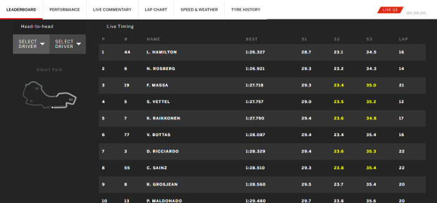
There are 20 cars listed, but I can only see 10 at a time on my laptop.
While users do scroll to read content and navigate their way through a website, the usage for a live timing function is very different. You need to be able to glance at the screen and see how a driver is doing at any one time. Having to constantly scroll just to see the times is hugely frustrating.
My initial solution
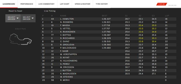
I noticed that just one small tweak, it was possible to remove the need to scroll as much without destroying any of the functionality.
Fix to make the web timing more usable. Inspect Element. Select SP_leaderboardrow and untick 'height: 51px;' @f1 pic.twitter.com/UBoWUbF7KN
— Duncan Stephen (@vee8) March 13, 2015
Using Inspect element in Chrome, or a similar function in your browser of choice, it is possible to reduce the height of each table row just by unticking one box.
My tweet got a fair few retweets among the hardcore contingent who were watching Formula 1 practice at 2am like me. So I knew I wasn’t the only one feeling a few frustrations with the new live timing system.
So after using the system for qualifying this morning, I worked a bit more to improve the user experience further.
Further enhancements
As well as the spacing, I felt that the typography required improvement. The typeface, Benton Sans, is a very readable font. But in this case the designers have decided to use bold throughout the entire timing screen.
While the occasional use of bold text can be a powerful device in a design, using it throughout is pointless. In this case, I felt that it reduced the readability of the text.
By removing bold text, I feel that the readability is greatly improved.
This is the final result:
Overall, I achieved these design enhancements with just four CSS rules.
I am sure that the team behind Formula1.com will make such improvements based on user feedback and the usability testing they will be doing. But in the meantime, I think my quick fix solution can improve the user experience right now.
You can install it in time for the Australian Grand Prix, the first race of the season.
Before and after

Install this yourself
If you prefer my design, it is very easy to install. I have made my custom stylesheet available via Stylish.
This browser extension is available on Chrome and Firefox. It allows users to install custom stylesheets to tweak website designs to suit their specific needs better.
What I did in detail
I achieved this improved design with just four CSS rules:
- Reduced the height of table rows.
- Changed the font weight from bold to normal.
- Increased the font size.
- Reduced the line height of the text.
After some testing, I added one additional rule to change the size of the tyre graphics used on the tyre history screen.
Update: Now compatible with the 2016 system
Some tweaks to the live timing system for the 2016 season had briefly rendered my custom stylesheet useless.
With 22 cars on the grid in 2016, it is even more important to save space and not include any unnecessary padding.
So I have now updated the stylesheet to become compatible with the 2016 system.
Thanks for your efforts Duncan. Especially good for those late GMT Grand Prix races when, with bleary eyes, it is even easier to become frustrated by ill though-through interfaces.
This Article was mentioned on duncanstephen.co.uk